There are only a few days before the 2021 LCS season kicks off. But before that, Riot Games revealed a major rebrand of the league’s identity today with a new logo, overlays, and mottos for the top North American League of Legends competition.
Riot has been actively revamping all of its leagues, the most recent being the LCK rebrand and its transition to a franchised league. It’s only been two years since the LCS underwent changes, such as the EU LCS becoming the LEC in a successful rebrand. Riot is now renewing its other major Western league to adapt it to the current times.
With this rebrand, purple is the main color for the latest chapter of the LCS. Probably the most shocking novelty is the new logo, which is radically different from the one League fans are used to. It has a more modern touch and fans can see the letters spell out LCS.
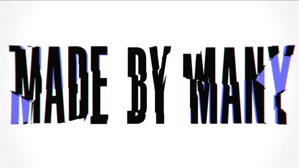
With “Made by many” and “All for the game” as its main mottos, the LCS will try to achieve a strong and unique personality that’s completely different from its European brother league.
This isn’t the first major change to the LCS for the upcoming season, though. Riot announced a completely new format for the league last month, including the suppression of the Spring Split playoffs and a new “Lock In” tournament.
This rebranding will be first used in the 2021 LCS Lock In tournament, which will start on Jan. 15.
Make sure to follow us on YouTube for more esports news and analysis.
