While most of the exciting new content arriving in Genshin Impact’s massive 4.0 update is focused on expanding to include the Hydro region of Fontaine and its massive roster of new playable recruits, miHoYo is also introducing an unexpected QoL update to the character menu with it.
Leaks for 4.0 have revealed that the character selection and party setup menus will be receiving a major overhaul that players are already comparing to one of miHoYo’s other gems, Honkai: Star Rail. Currently, when Travelers select a character to join the team or view their overall team in Genshin, all characters are pretty stagnant and stand in an identical pose.
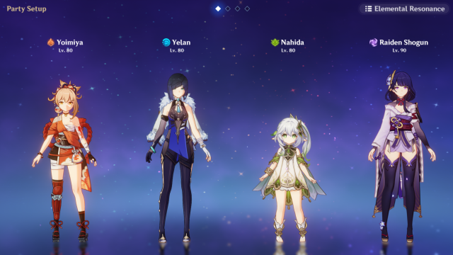
The current system lacks personality as every recruit poses in the same way and is overall fairly still. Nothing unique happens when players swap out any member of the team either, so adding characters to a team is a fairly simple and unremarkable process.
But after the Version 4.0 update launches later this year, crafting a team or changing the way an existing lineup looks is going to become a lot more intriguing, based on the recent leaks. Every one of Teyvat’s playable recruits is receiving a unique animation that plays when Travelers select them to join their team.
Related: Who are the Fatui Harbingers in Genshin Impact?
Alongside this, the party setup page is also receiving a massive redesign for the 4.0 update. In addition to smaller changes like a new moving background, the overall party setup screen has been zoomed out and each of the four playable recruits has been shifted so they can now take up unique poses on the team rather than standing still in the same generic pose.
All characters will also have more movement, which brings the party setup page to life. Based on the one leak of this screen that has surfaced, it seems like each playable recruit will have their own unique pose in this menu as Lynette is holding her top hat for her pose and Lyney is posing with a card. These poses are very specific to their skillsets, which is a good indicator that every character will have some kind of unique pose on this menu.
Players are drawing massive comparisons to Honkai: Star Rail with the new menu overhaul and celebrating the change as it seems like a good indicator that the devs are listening to what players like. The Genshin version of character loading and the party setup page certainly features some similarities to what is present in Honkai: Star Rail but it also seems to improve upon the style to add even more personality into the mix.
In the Honkai: Star Rail team setup page, all of the playable recruits load in with unique poses, move slightly, and are situated at different points across the screen. All characters also wield a weapon on this page and the overall design is packed with personality to help distinguish each character from the next.
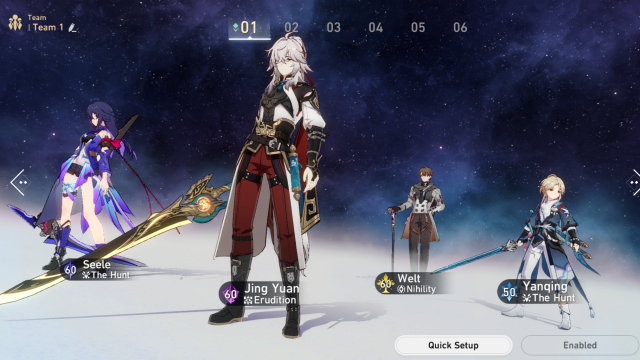
Although the Genshin version of this system certainly has some massive similarities, the style has been adapted to fit the more whimsical, fantasy style of Teyvat. Characters in Honkai: Star Rail also don’t have unique load-in animations whereas those in Genshin will.
The leaked animations have Genshin players quite excited about what the Fontaine update will include, with many players being surprised at how good they look. One player was so impressed, they said the leaked animations “don’t even look like Genshin.”
Another fan pointed out that the new Genshin screen is “so similar” to the one featured in Honkai: Star Rail and feels like miHoYo is paying attention to what players like in its other games and adding similar features to Teyvat.
This new menu system might seem like a small change, especially in comparison to the massive amount of content arriving in the Fontaine update, but most players are in agreement that this small QoL improvement is a drastic improvement to the game overall. After seeing the new animations, one Genshin player said, “It’s crazy how adding something so small can make such a big difference.”
The leaks for this feature were uncovered as part of Genshin’s upcoming Fontaine Version 4.0 update, so players can likely expect this feature to launch with the update sometime in August. Since it’s such a major overhaul to how the menu functions now, it’ll likely be included in the first major update but could also potentially be released as a Version 4.1 or later update depending on how the devs decide to break up the new content.


Published: Jul 6, 2023 12:22 pm