Valve finally blessed the Counter-Strike community with more CS2 beta invites. Many players have enrolled following the Aug. 31 update and immediately fell in love with Inferno, which was added alongside.
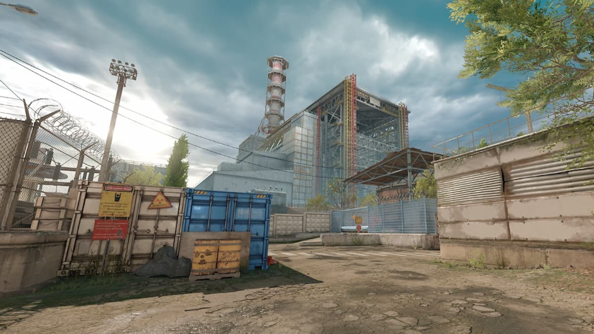
Inferno was one of the maps that were overhauled with CS2, meaning it not only saw a visual update but some of the positions were significantly altered. But, so far, the community has been praising how beautiful it looks under this Aug. 31 Reddit post.
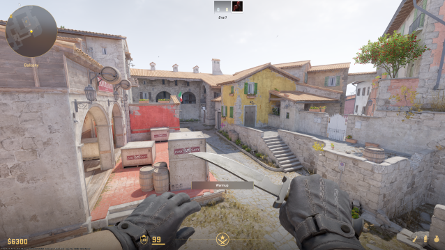
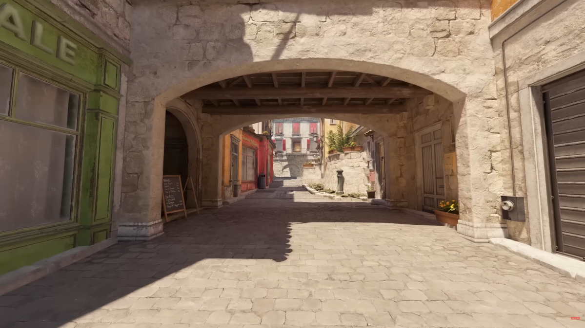
“Inferno is jaw-droppingly gorgeous. They seriously outdid themselves. Screenshots do not do it justice. You have to see it for yourself,” one of the top comments reads. If you have found yourself getting access to the CS2 beta, I personally couldn’t recommend it more. A few hours back, I was launching the game just to grab some screenshots, and what followed was the 20-minute admiration walk throughout the map.
One thing players also admired was how lighting works on the new Inferno. The map is incredibly well-designed in terms of lighting, with zero areas that are hard to navigate due to darkness, even Apartments.
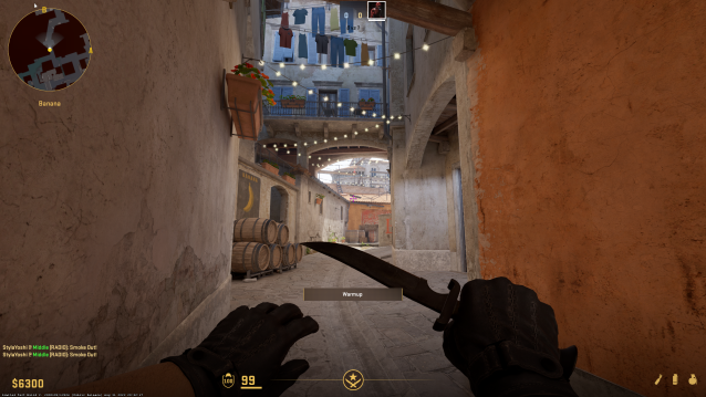
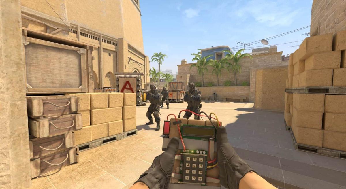
On top of that, the developers revamped a bunch of areas, like Mid or Banana. In both spots, there are additional buildings over them, meaning it won’t be as easy to throw Grenades at them from now on. Or, they could make it actually easier. It’s hard to tell at the time of writing since the map was added a few hours back. But, we’re certain once pro and skilled players put some time into it, they will figure out a bunch of possible nades.





Published: Sep 1, 2023 07:54 am